


THE CHALLENGE
A beloved destination needs more than a new look
Isle of Palms occupies a unique space: a close-knit coastal community, a family vacation destination, and a city responsible for serving the people who call it home. Bringing those identities together requires more than a visual refresh.
Inconsistent messaging and visual applications can make it difficult to communicate a clear, recognizable identity. The challenge was to establish a shared foundation that reflects the community's character, supports responsible tourism, and gives the City a more cohesive way to communicate.
THE INSIGHT
Don't reinvent the place. Understand what makes it irreplaceable.
The strongest destination brands aren't manufactured in a conference room. They're uncovered through the people, experiences, traditions, and values that give a place its identity.
For Isle of Palms, that meant starting with listening rather than designing. Before deciding how the brand should look or sound, we needed to understand how the island is experienced, what its community wants to preserve, and how its identity can be communicated more clearly.
"When you cross the peak of the Connector and see the island, you feel like you're home."
THE STRATEGY
Listen first. Find the common thread. Build from there.
We approached the initiative as a strategic branding exercise, not simply a logo redesign. The discovery phase brings together an audit of existing communications, destination and tourism research, competitive analysis, and community and stakeholder perspectives.
The objective is to identify the qualities that distinguish Isle of Palms and translate those findings into a more cohesive brand foundation - one that can guide messaging, visual identity, and communications across the City for years to come.
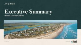
Executive Summary Report
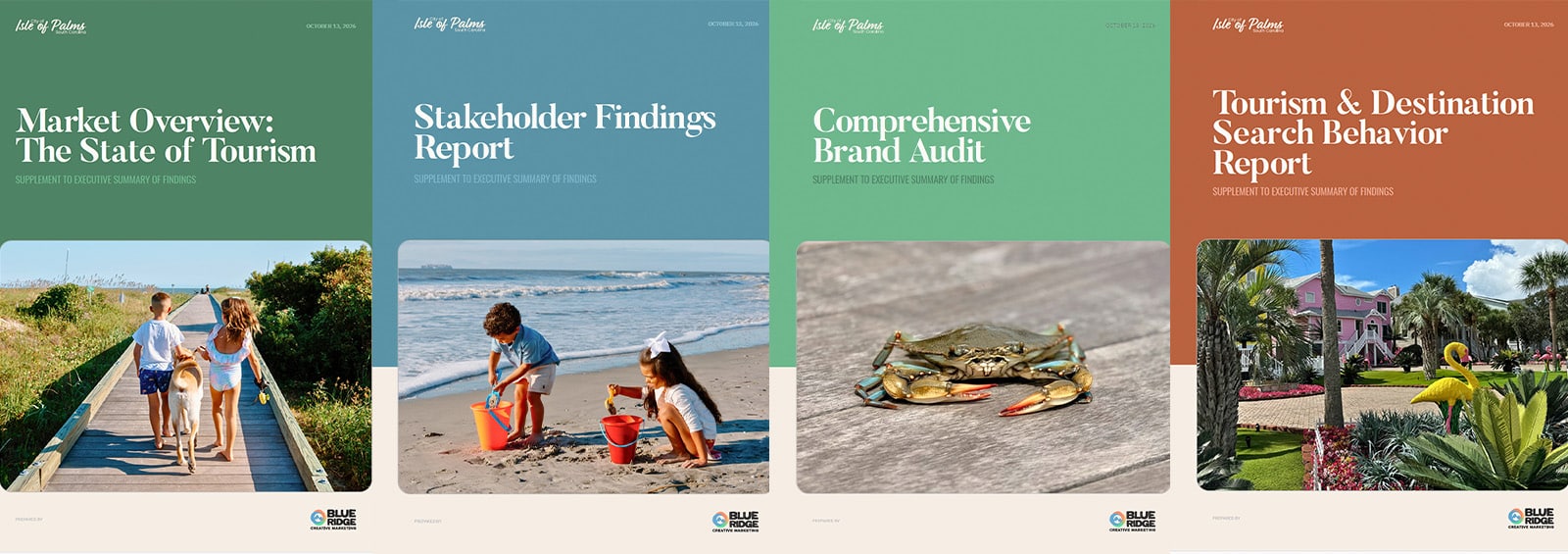
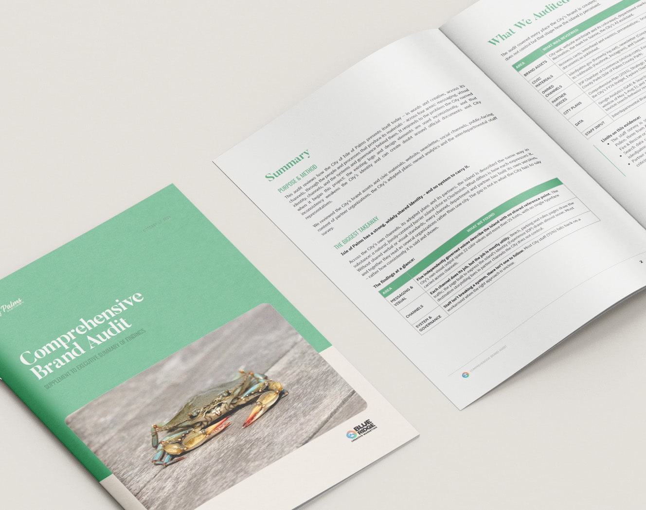
Individual Reports
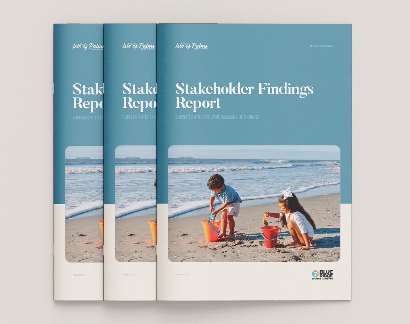
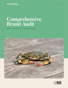
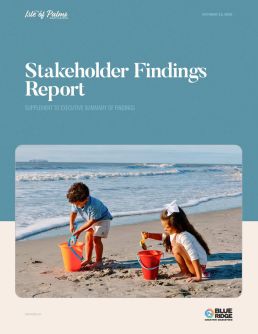
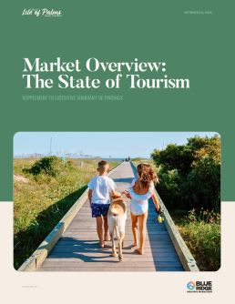

I think Blue Ridge hit the nail on the head... very impressed. I look forward to seeing how this work translates to the visual identity.
- DOUGLASS KERR, IOP CITY ADMINISTRATOR

THE TAKEAWAY
A stronger destination brand starts with a deeper understanding of place.
For Isle of Palms, the opportunity isn't to become something new. It's to define what makes the community distinct and create a clearer, more consistent way to express it.
By putting research and community perspective at the center of the process, we're building the foundation for a brand that can serve both the people who call the island home and the generations who come to experience it.
CLIENT:
Isle of Palms, SC
INDUSTRY:
Government / Tourism
SERVICES:
Tourism branding, brand strategy, research, messaging strategy
TIMELINE:
2026
rgba(30, 58, 59, 1)
C84 M58 Y6t1 K63
#1E3A3A
rgba(245, 238, 228, 1)
C03 M04 Y09 K00
#F5EEE4
rgba(90, 147, 166, 1)
C67 M31 Y28 K01
#5A93A6
rgba(185, 99, 63, 1)
C22 M69 Y82 K08
#B9633F
rgba(79, 131, 101, 1)
C71 M30 Y68 K11
#4F8365