The Background
After announcing her candidacy to take Utah’s 4th Congressional seat back for the GOP, Kathleen Anderson was ready for war, and she needed all the pieces on her side. The seat was hers to lose, but some changes had to be made at the state and local levels starting with a simple comms plan and straightforward political messaging that spoke plainly to voters in a non-condescending way.
"Democracy is based upon the conviction there are extraordinary possibilities in ordinary people."
- Harry Emerson Fosdick
The Strategy
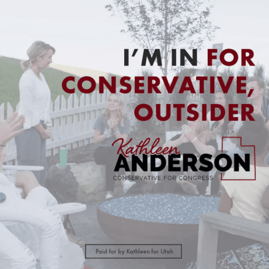
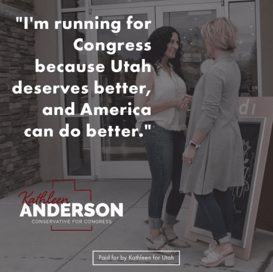
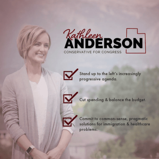
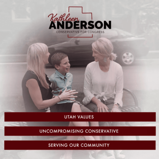
Use a modern, bold color scheme along with “strong”-looking font combinations balanced against subtly overlaid still-photography to help communicate Kathleen’s unwavering conservative values and friendly, approachable personality all at once.