


THE CHALLENGE
Making and intimate service feel approachable.
Sex therapy can be difficult to talk about - especially for someone considering it for the first time.
Karen needed a brand and website that could introduce her new practice with warmth and personality while giving prospective clients the information and confidence they needed to take the next step.
THE INSIGHT
The right brand can make difficult conversations easier.
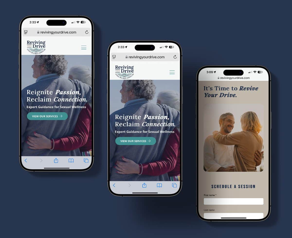
For Reviving Your Drive, we didn't want the experience to feel clinical or overly serious. We created something understated, elegant, and approachable... giving sexual wellness counseling a visual identity that felt inviting rather than intimidating.
"Make the conversation a little easier."
THE STRATEGY
Bringing personality to sexual wellness.
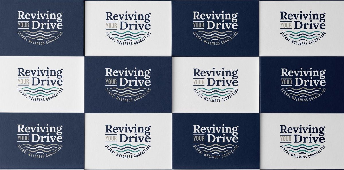
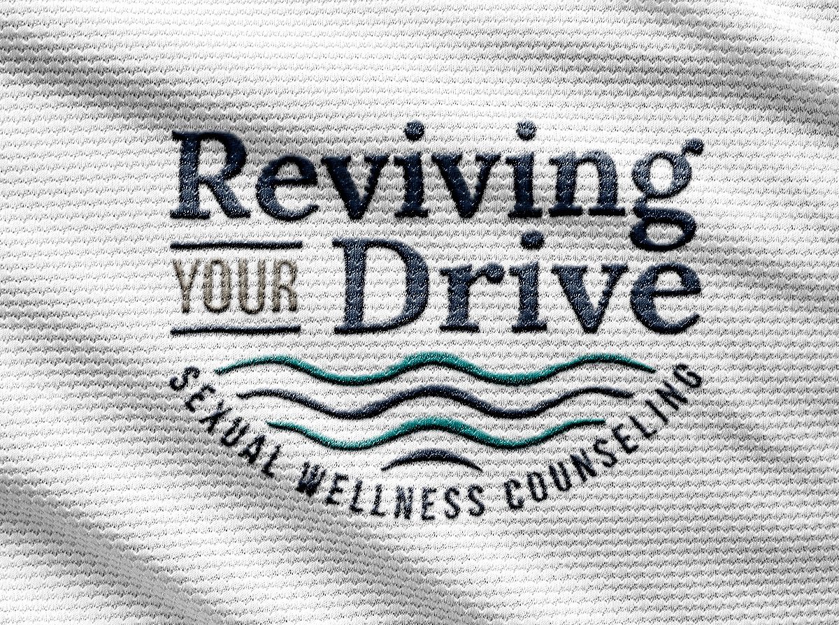
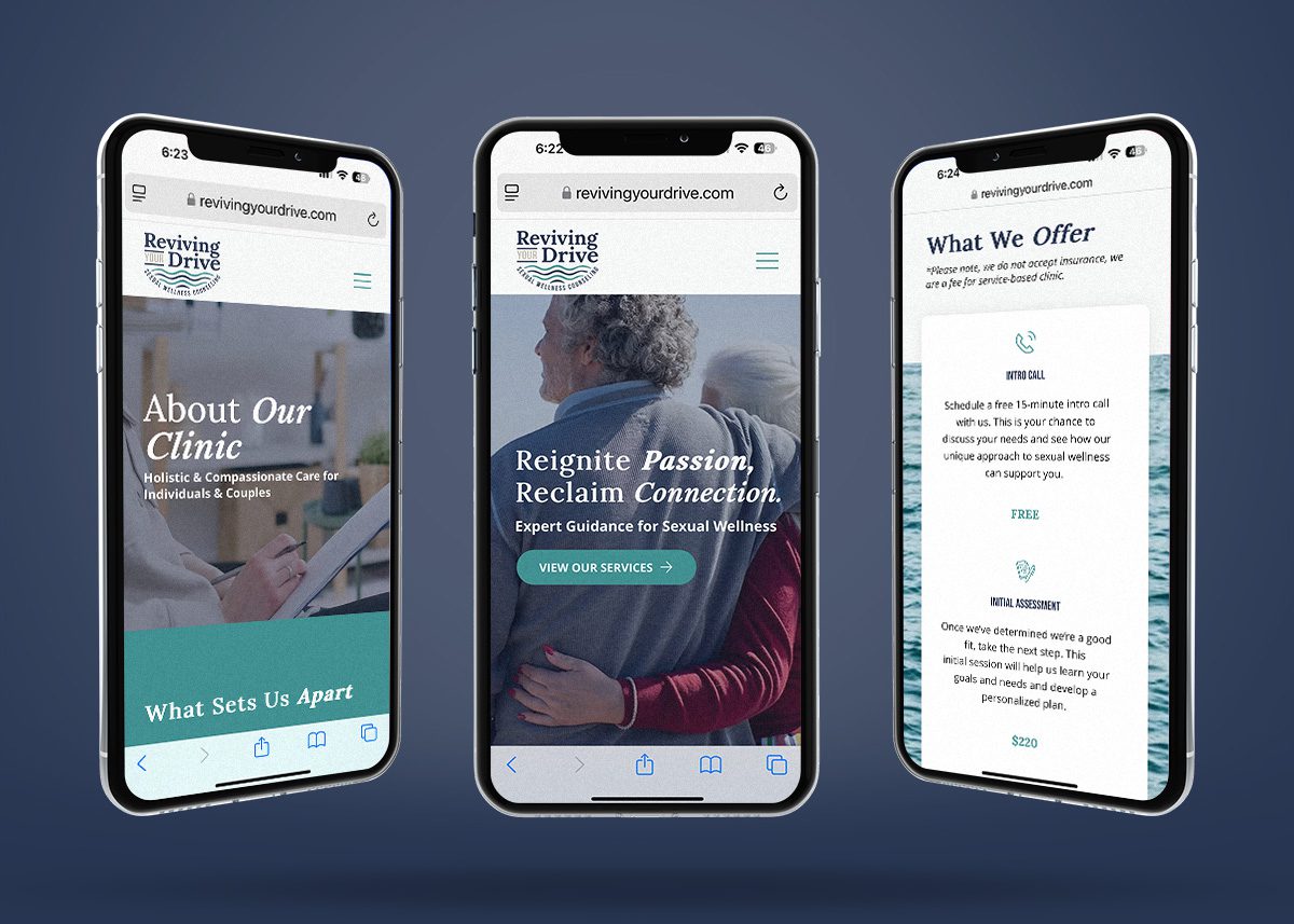
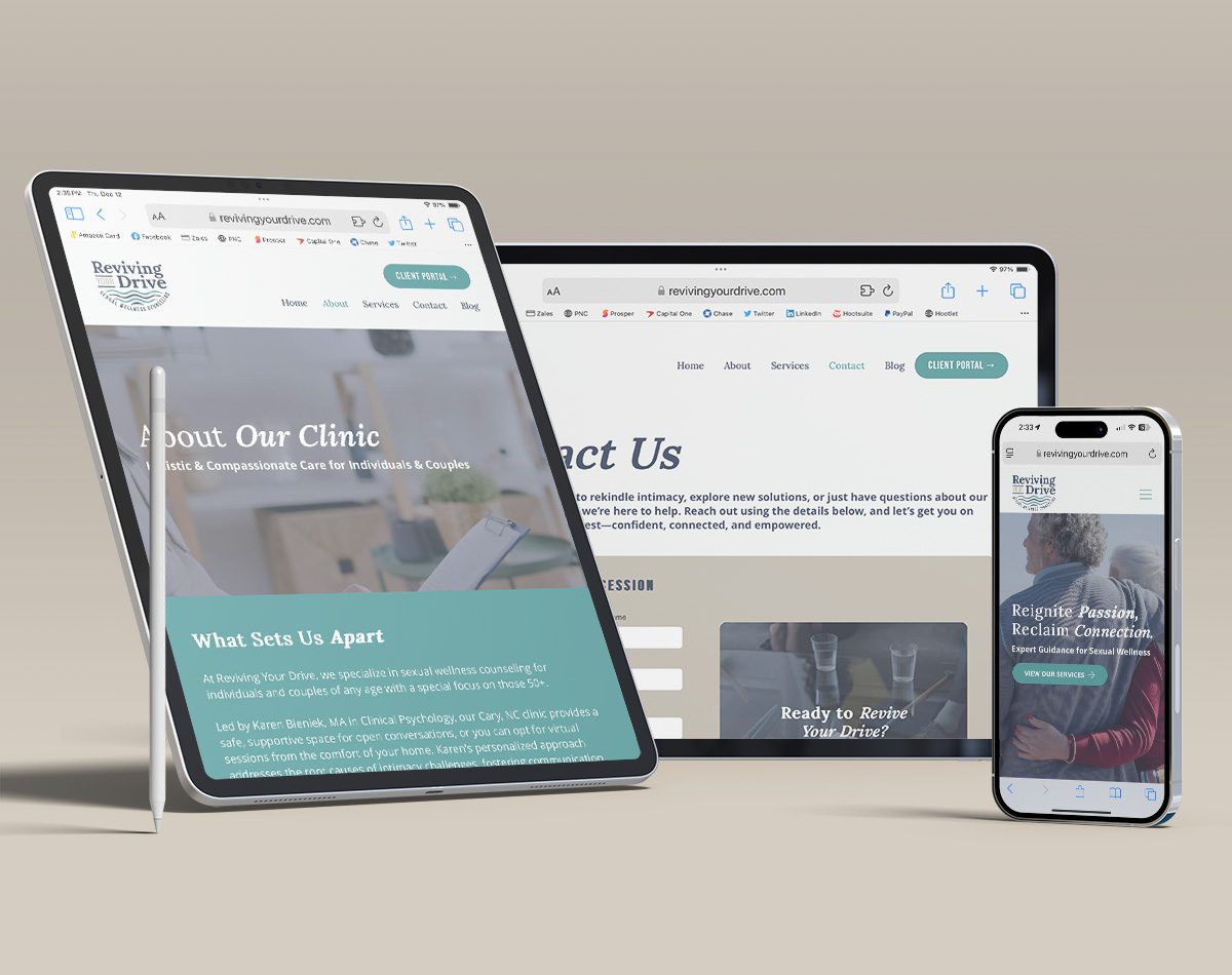
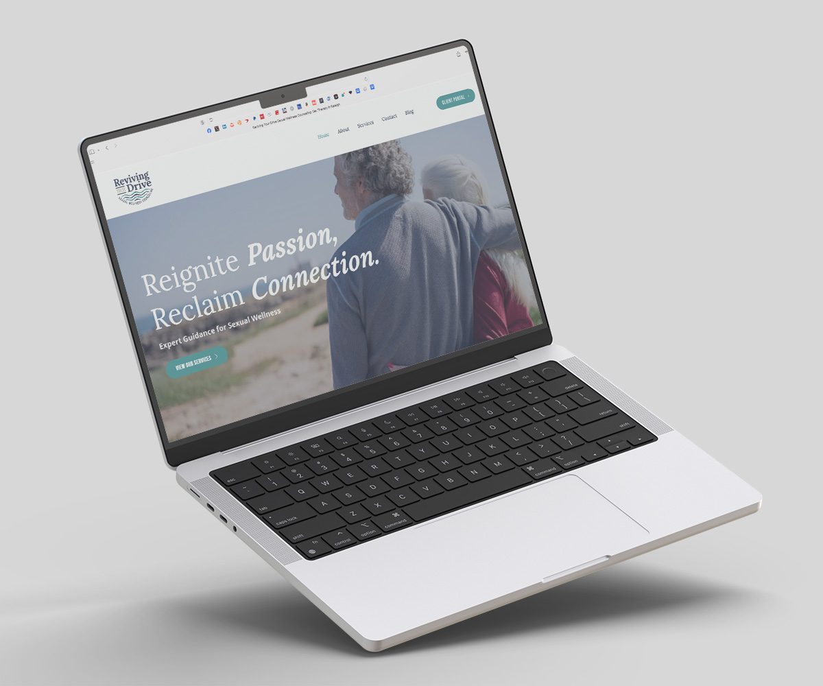
We built the identity around Karen's personality and the experience she wanted to create for clients. A simple, elegant logo, coastal-inspired color palette, and subtle wave pattern gave the brand warmth and personality without relying on the typical visual language of healthcare.
BRAND DESIGN
Coastal, calm, & anything but clinical.
The color palette draws from the interior of Karen's office, while a simple wave pattern adds a subtle nod to her love of the coast. Paired with a mix of serif and sans serif typography, the identity feels sophisticated, approachable, and distinctly her own.

Blue Ridge Creative Marketing did an amazing job on developing my logo and creating my website... I think they will be an integral part of helping me grow my business.
- KAREN BIENIEK, REVIVING YOUR DRIVE

THE TAKEAWAY
The best brands make people feel comfortable enough to take the first step.
For Reviving Your Drive, we created a brand and website that gives sexual wellness counseling a warmer, more approachable presence - one that reflects Karen's personality and makes an intimate service easier to understand and explore.
CLIENT:
Reviving Your Drive
INDUSTRY:
Healthcare
SERVICES:
Brand design, creative direction, web design, content strategy
TIMELINE:
2025
rgba(39, 53, 81, 1)
C52 M35 Y00 K68
#273551
rgba(64, 144, 146, 1)
C56 M01 Y00 K43
#409092
rgba(192, 185, 172, 1)
C00 M04 Y10 K25
#C0B9AC