


THE CHALLENGE
Great places deserve great first impressions.
Red's Corner had outgrown its website. Important information was difficult to find, the experience didn't reflect the venue's personality, and first-time visitors weren't getting a clear picture of what made the space special.
THE INSIGHT
A website should make people want to visit.
For first-time visitors, the website is often their introduction to the brand. Instead of simply sharing information, we designed an experience that captured the energy, personality, and community that make Red's Corner unique.
"A great hospitality website should make visitors want to be a part of the experience"
THE EXPERIENCE
Designed to feel as welcoming as the venue.
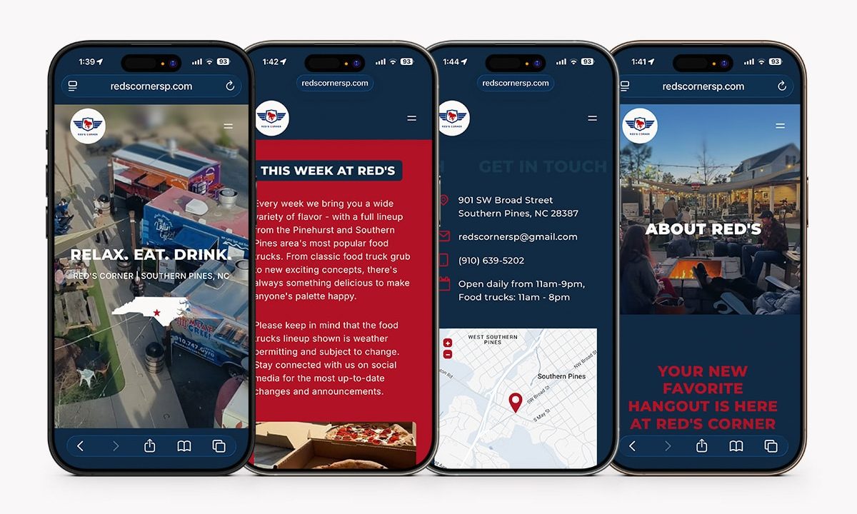
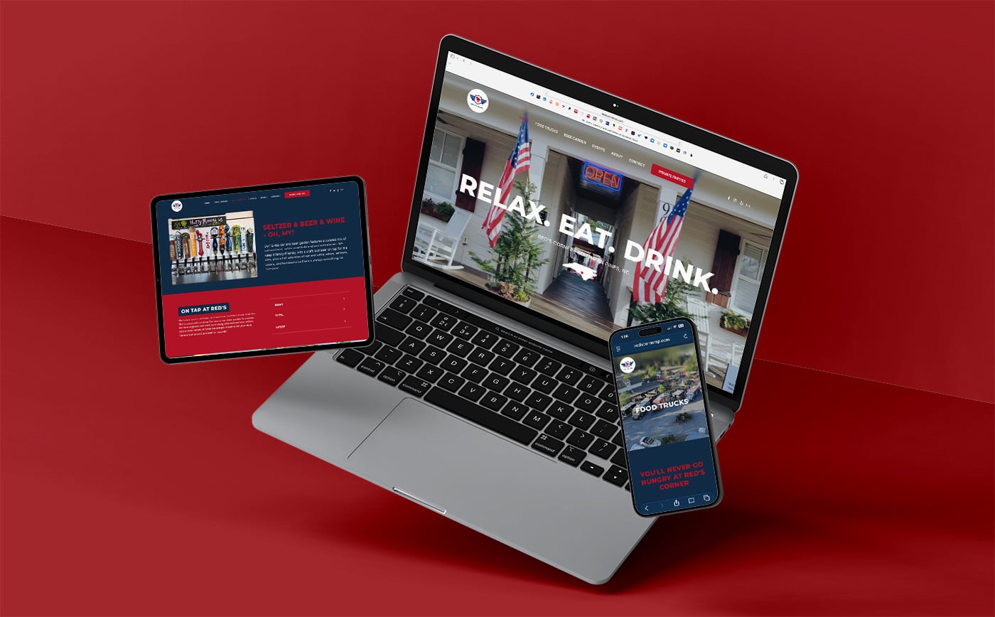
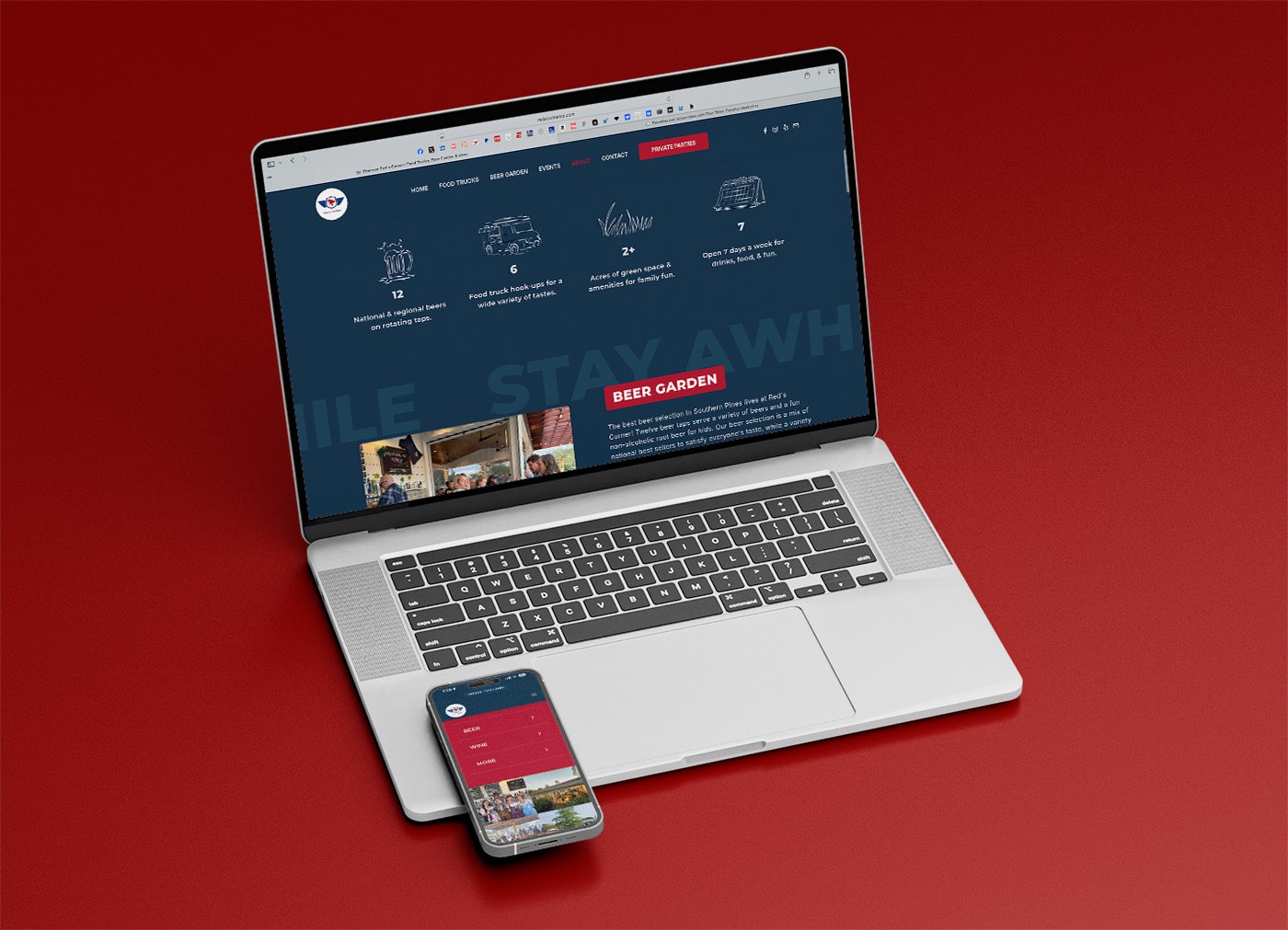
Every page was built around one goal: helping visitors quickly find what they're looking for while immersing them in the Red's Corner experience.
From bold visuals and intuitive navigation to clear calls to action, every interaction reinforced the brand's personality.

Discover
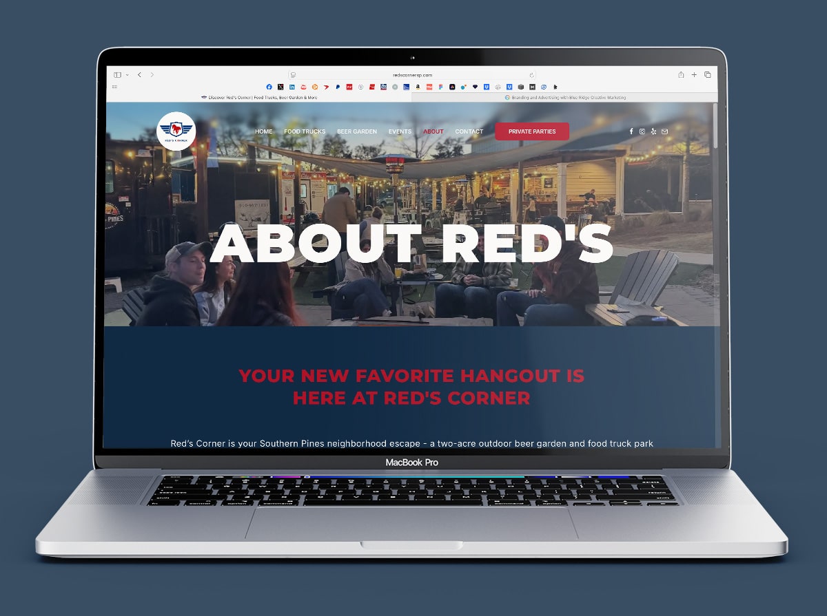
A cinematic hero immediately introduces visitors to the atmosphere and energy of the venue.

Explore
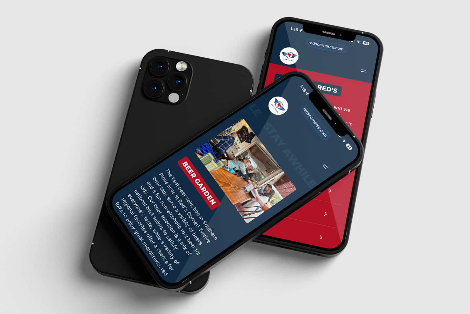
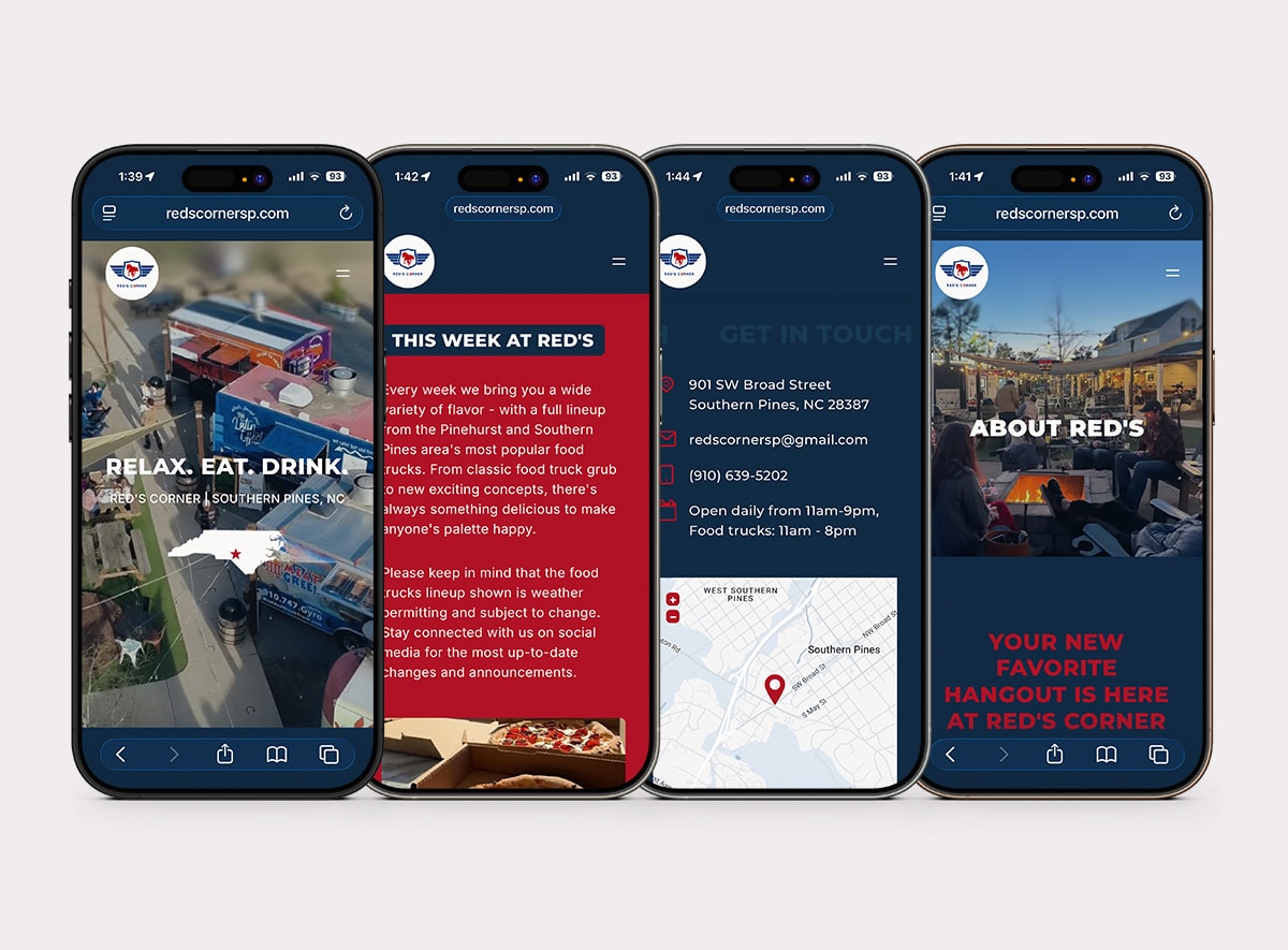
Simplified navigation makes food trucks, events, drinks, and live music easy to find.

Visit
Clear calls to action encourage visitors to stop browsing and start planning their next visit.

From the very first conversation, I knew we found the company that would redo our website. Aaron and his team gave life to our vision with some unexpected but very welcome upgrades.
- SCOTT BERTRAND, RED'S CORNER

THE TAKEAWAY
Great hospitality starts before guests arrive.
A website shouldn't just communicate information... it should create anticipation.
For Red's Corner, we designed a digital experience that makes visitors feel like they're already there.
CLIENT:
Red’s Corner
INDUSTRY:
Bar, restaurant, hospitality
SERVICES:
Web design, creative direction, SEO, copywriting, UX strategy
TIMELINE:
2026
rgba(16, 42, 67, 1)
C96 M80 Y47 K49
#102A43
rgba(117, 18, 38, 1)
C27 M100 Y95 K13
#B11226
rgba(250, 249, 247, 1)
C01 M01 Y02 K00
#FAF9F7
rgba(23, 58, 52, 1)
C94 M73 Y45 K37
#173A52