


THE CHALLENGE
One organization. Dozens of races. Countless voters.
Political direct mail has seconds to earn someone's attention.
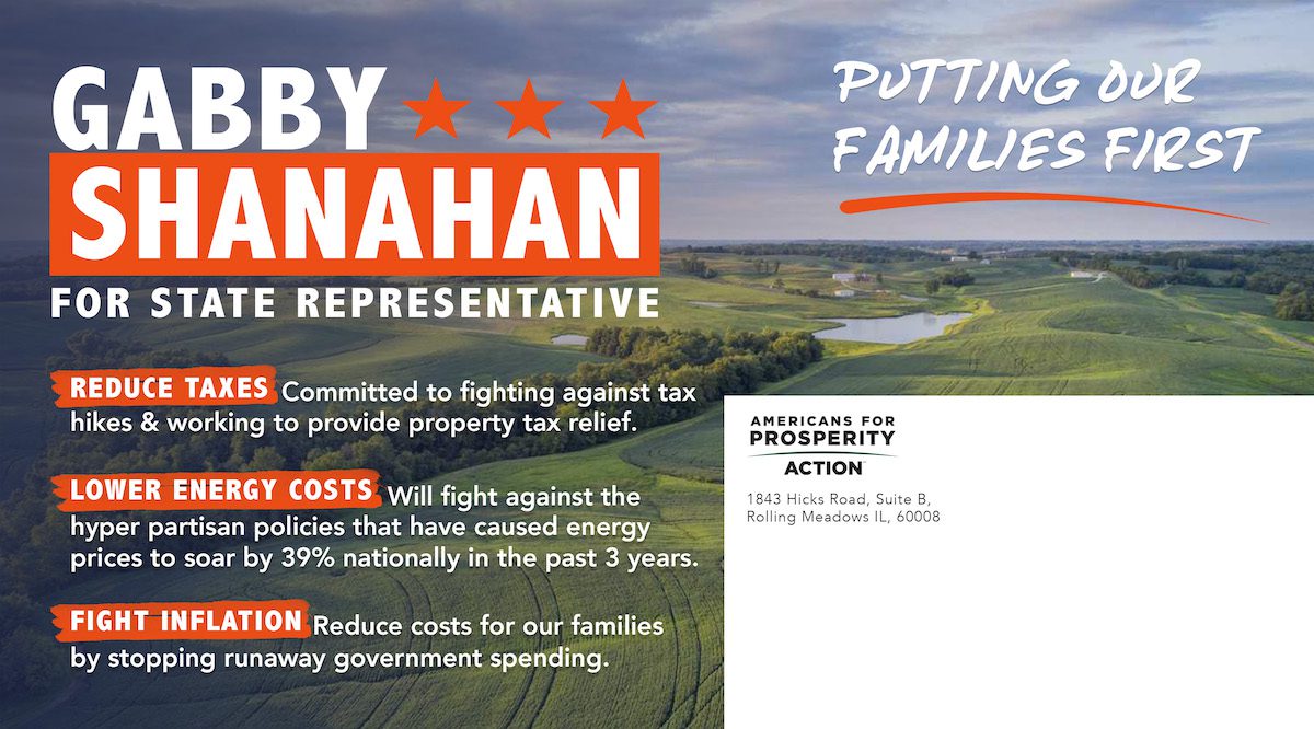
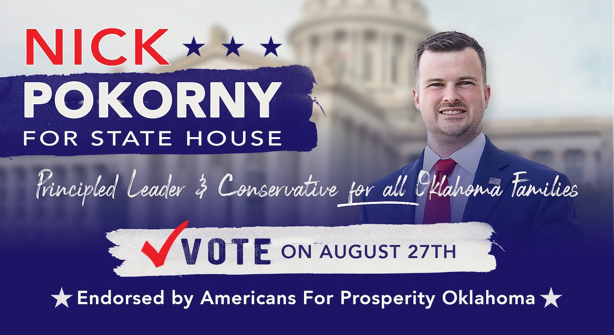
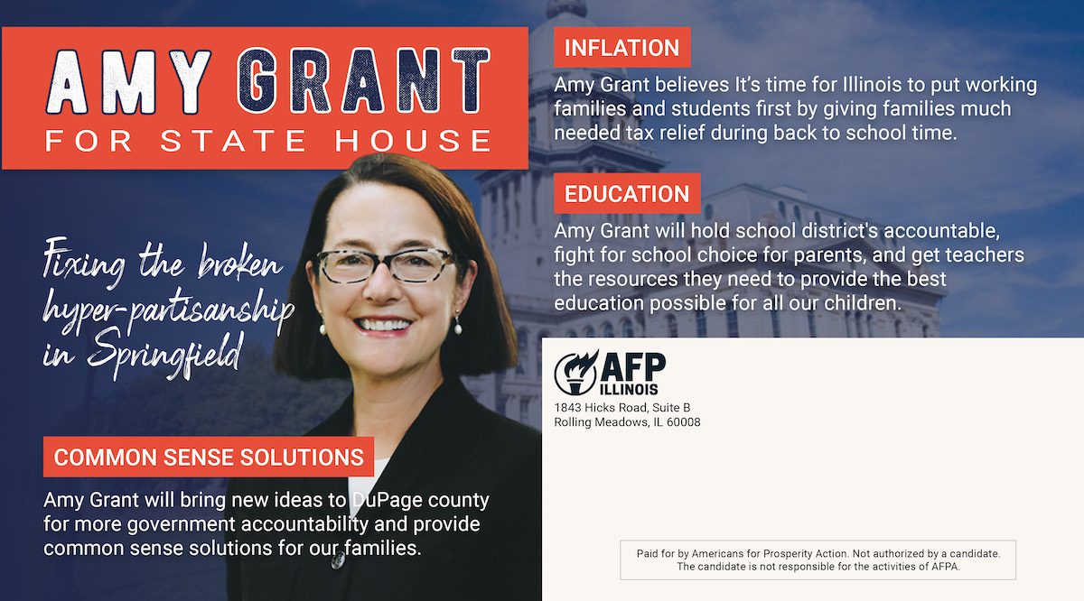
Working across multiple state elections and candidates meant creating pieces that could adapt to different races and messages while still feeling bold, cohesive, and unmistakably part of the AFP campaign.
THE INSIGHT
Political mail doesn't have to look like political mail.
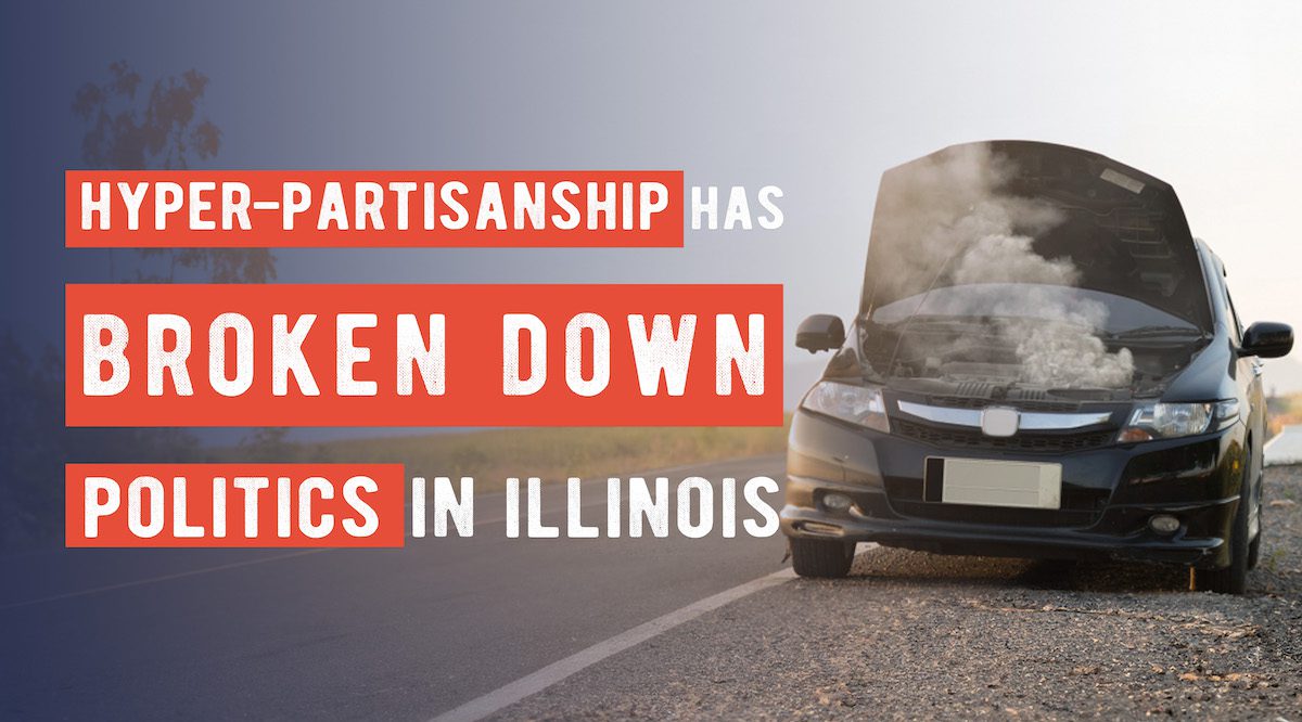
Instead of relying on the predictable visual language of campaign advertising, we focused on strong headlines, bold compositions, and clear messaging designed to make each piece impossible to ignore.
The goal wasn't simply to get a mailer opened. It was to make the message remembered.
"Don't just get their attention... Get remembered."
THE STRATEGY
One creative system. Many political messages.
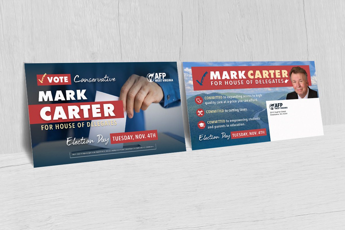
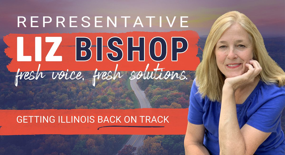
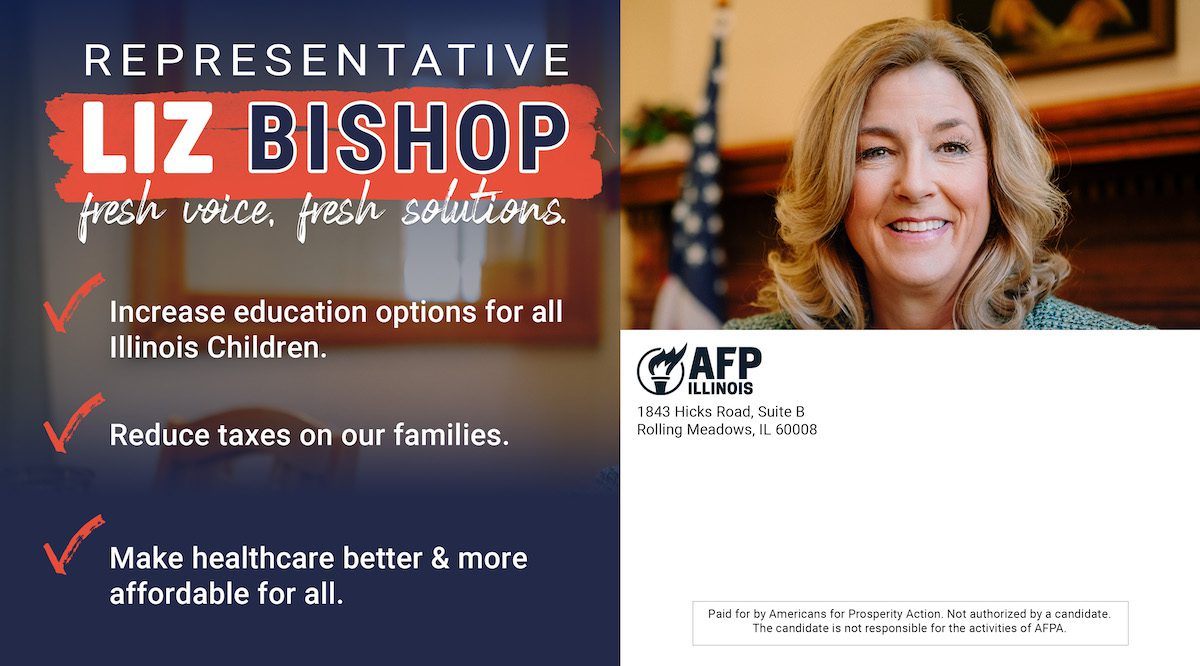
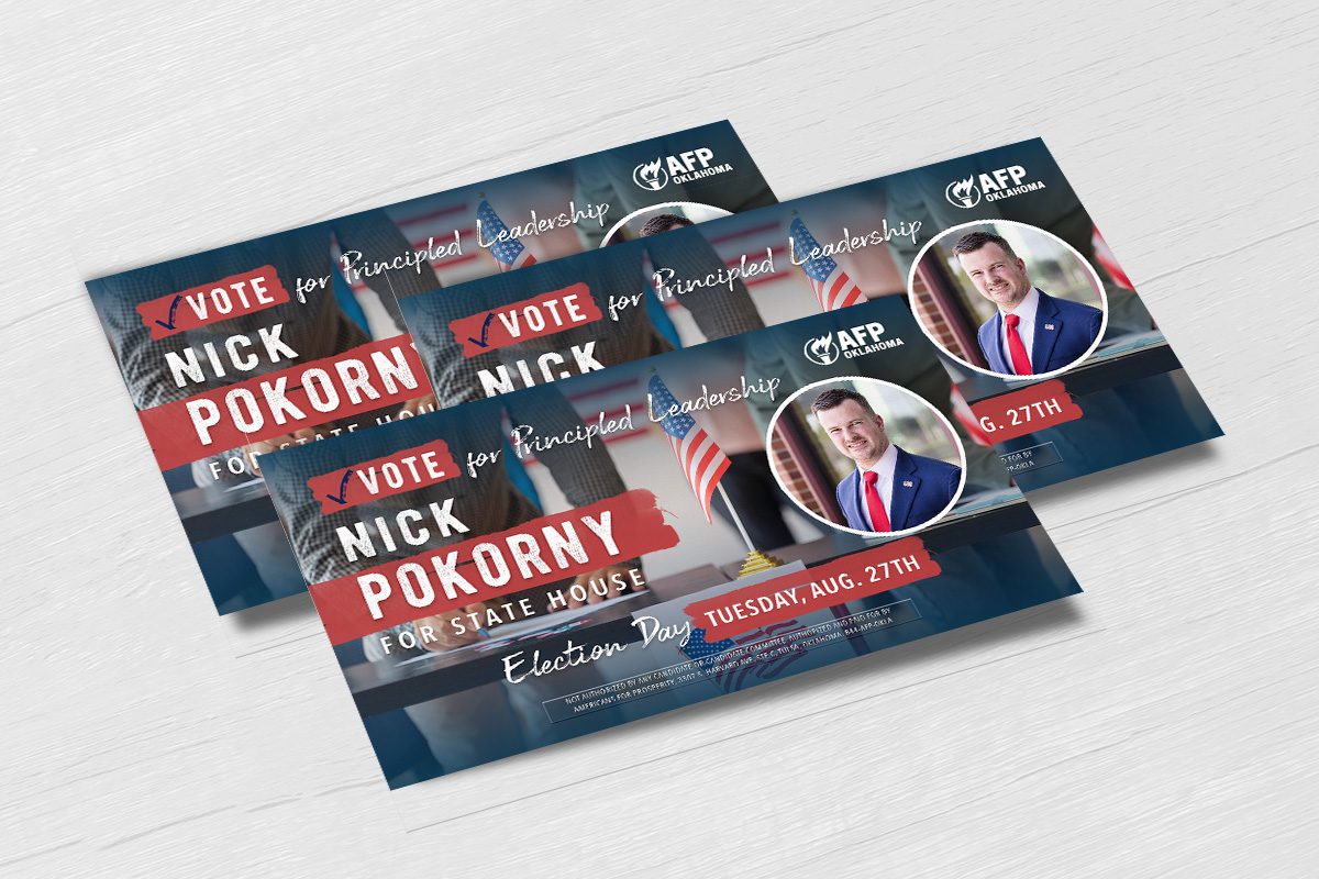
We developed a flexible visual approach that could be adapted across candidates, issues, and states without losing its impact. Strong typography, bold imagery, and clear messaging gave each piece its own personality while maintaining a cohesive campaign presence.
THE WORK
Designed to get noticed.
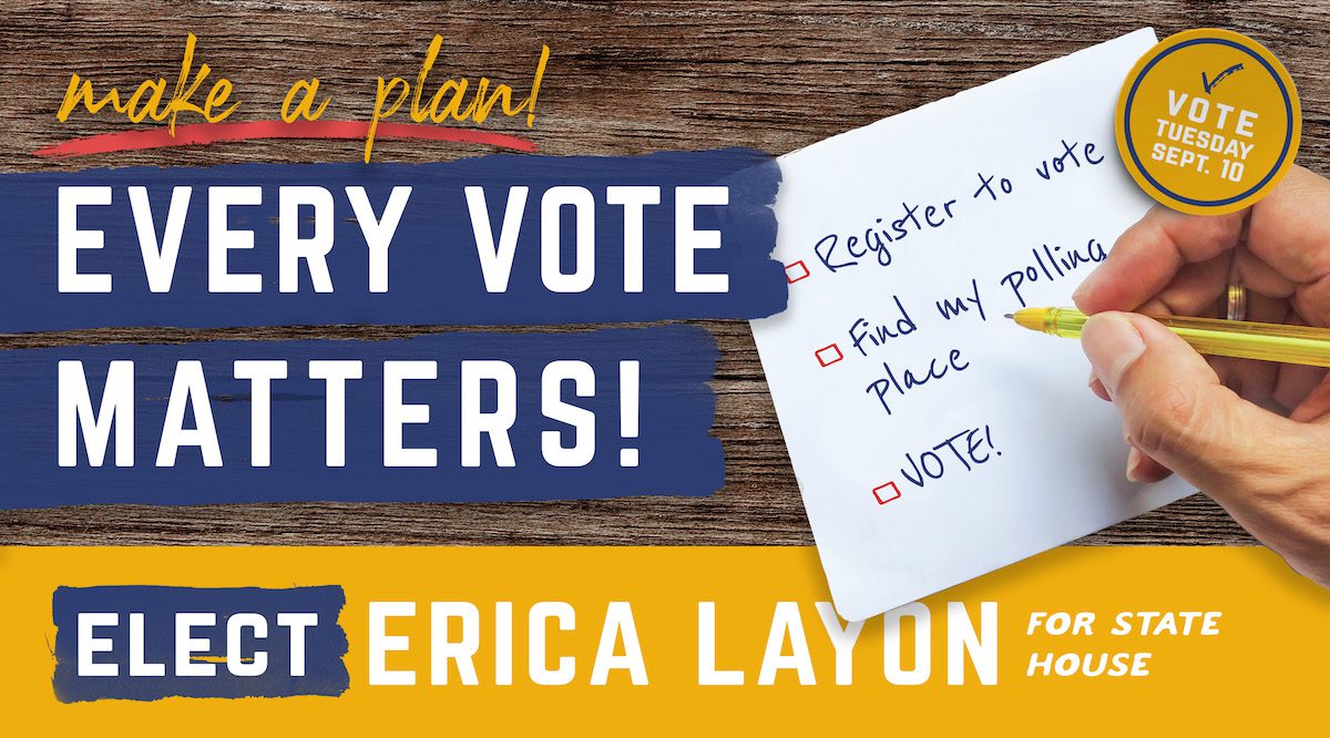
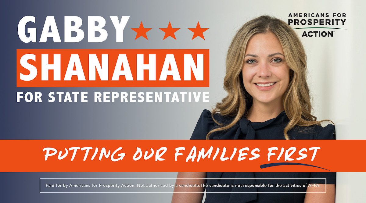
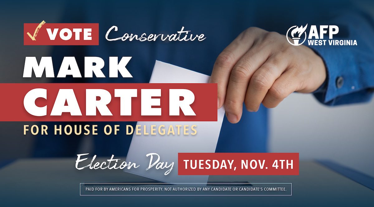
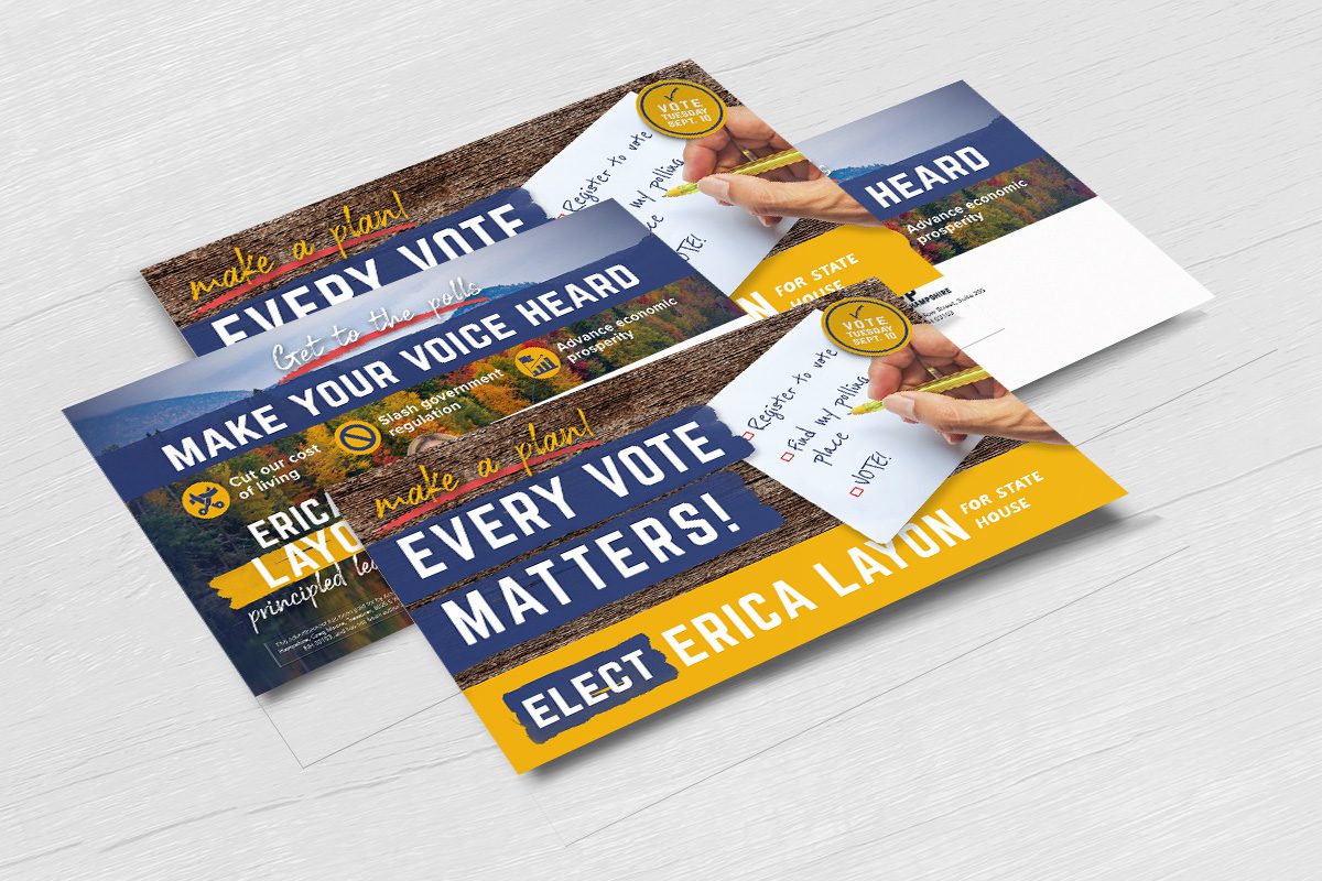
From candidate mailers to GOTV pieces, each execution was built around a clear message and a strong visual hierarchy. The result was a collection of direct mail pieces designed to cut through the noise of a crowded election season.
THE TAKEAWAY
Good political advertising makes complicated messages simple.
For Americans for Prosperity, we created a flexible direct mail and advertising system capable of carrying different candidates and messages across a nationwide election effort - all while giving each piece the visual impact needed to compete for attention.
CLIENT:
Americans for Prosperity
INDUSTRY:
Politics
SERVICES:
Art direction, graphic design, print design
TIMELINE:
2024
rgba(49, 101, 53, 1)
C51 M00 Y48 K60
#316535
rgba(0, 32, 42, 1)
C100 M24 Y00 K84
#00202a
rgba(255, 188, 61, 1)
C00 M26 Y76 K00
#FFBC3D
rgba(255, 255, 255, 1)
C00 M00 Y00 K00
#FFFFFF